

What ChartGPT Does
ChartGPT is a single-purpose chart maker. You paste a table or CSV, or just type your numbers into a sentence, and it reads the shape of the data, picks a chart, and draws it. There is no dashboard, no spreadsheet grid, and nothing to configure first, just one input box and one canvas.
That opinionated streak runs through the output. Bars begin at zero, rankings sort themselves, and pointing at one bar greys out the rest so a single figure stands out. It is aimed at consultants, founders, marketers, and students who need a clean chart for a slide and do not want to wrestle a charting library late at night. Unusually for the category, all nine chart types and every export format come with the free plan.
What Happened When We Tested It
Every chart below started as a plain English sentence typed into the box on a free account. No tables were pre-formatted, no data was cleaned first, and nothing was tidied on our end. The point was to see how the tool behaves on raw input, including the messy paste it advertises as a strength.
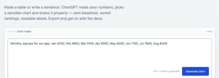
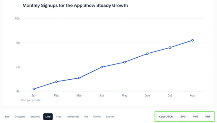
Monthly signups with no chart type named
Test 01 . Type detection"Monthly signups for our app: Jan 4200, Feb 4800, Mar 5100, Apr 6000, May 6400, Jun 7100, Jul 7600, Aug 8200"
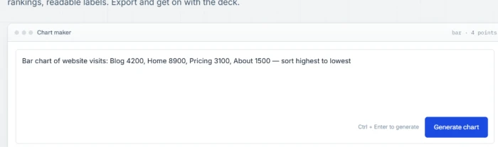
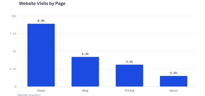
Sorting page visits highest to lowest
Test 02 . Ranking"Bar chart of website visits: Blog 4200, Home 8900, Pricing 3100, About 1500 — sort highest to lowest"
Donut from a one-line traffic split
Test 03 . Part-to-whole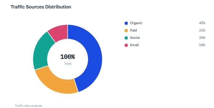
Switching an existing chart to an area view
Test 04 . Type switching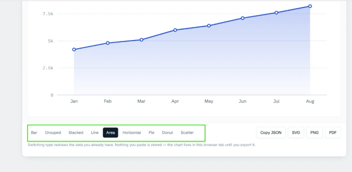
Exporting the finished chart
Test 05 . Output
Revenue in millions on the y-axis
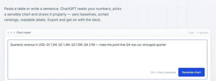
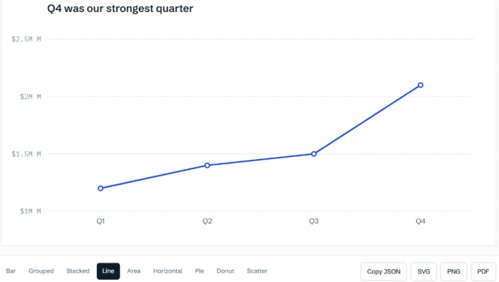
Test 06 . Axis bug"Quarterly revenue in USD: Q1 1.2M, Q2 1.4M, Q3 1.5M, Q4 2.1M — make the point that Q4 was our strongest quarter"
Exact figures on a messy regional paste
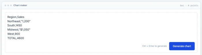
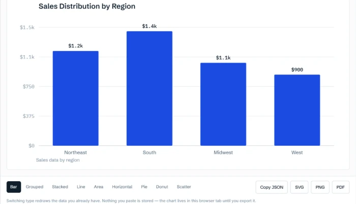
Test 07 . Label rounding"Region,Sales Northeast,"1,200" South,1450 Midwest,"$1,050" West,900 TOTAL,4600"
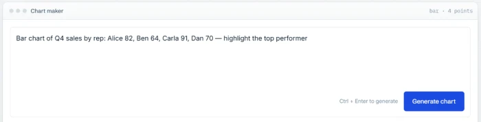
Highlighting the top performer
Test 08 . Emphasis"Bar chart of Q4 sales by rep: Alice 82, Ben 64, Carla 91, Dan 70 — highlight the top performer"
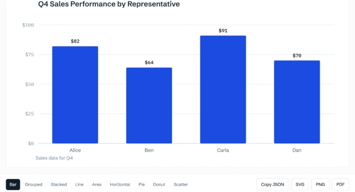
Every detection test, from the signup line through to the donut split, came back with the data shape read correctly and a title that made an argument. Pair that with instant type switching and free export, and the fast path from a sentence to a slide-ready chart holds up under real inputs.
The doubled "$2.5M M" axis and the ignored highlight both point the same way. Formatting and emphasis instructions do not reliably land, and because colours and the axis range cannot be overridden at all, there is no manual fallback when the AI skips what you asked for.
10-Point Feature Review
Pros and Cons
- Zero learning curve: a usable chart comes back from one typed sentence, nothing to configure
- Smart type detection: reads whether your data wants a line, bars or a donut and is right
- Titles that argue: the chart names the finding instead of restating the axis
- Instant type switching: flip to area or line and it redraws with no wait
- Clean multi-format export: PNG, SVG, PDF and JSON all sit under the chart
- Labels lose precision: exact figures round to
- No manual overrides: colours and the axis range cannot be set on any plan
- Nothing is saved: no chart history, so export before you close the tab or lose it
Pricing Breakdown
| Feature | Free$0/mo | Pro$14.99/moPopular | Team$49.99/mo |
|---|---|---|---|
| Charts a month | 15 | 100 | Unlimited |
| All nine chart types | ✓ | ✓ | ✓ |
| PNG, SVG, PDF, JSON export | ✓ | ✓ | ✓ |
| Rows per paste | 500 | 500 | 500 |
| Support response | Two working days | One working day | One working day |
| GST invoices | ✗ | ✓ | ✓ |
| Single sign-on | ✗ | ✗ | Google Workspace |
| API access | ✗ | Waiting list | 10,000 calls |
What you're actually paying for: Pro buys volume and little else. The 500-row paste limit and all nine chart types are identical on the free plan, so the jump from 15 to 100 charts a month is the real reason to pay, alongside faster support and GST invoices. There is no self-service upgrade button yet; Pro is arranged through the contact form, and a 14-day trial runs without a card. Team, at $49.99 a month, covers five seats and then $9 a seat, and is where unlimited charts, API access and Google Workspace single sign-on live. One catch worth pricing in before you rely on it: nothing you make is stored on any tier, so an unexported chart is gone when the tab closes.
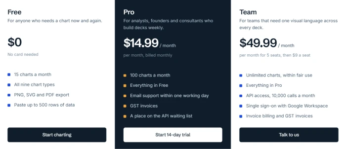
Pricing verified September 29, 2026. Figures move, so confirm them on the official pricing page before you subscribe.
ChartGPT vs the Top 3 Alternatives
| CChartGPT | JJulius AI | NNapkin AI | |
|---|---|---|---|
| Core job | Chart from a sentence | Full data analysis | Visuals from text |
| Free tier | 15 charts a month | Yes, credit-based | Yes, forever |
| Entry paid | $14.99 a month | $20 a month | $9 a person a month |
| Chart focus | Nine dedicated types | Charts plus code and stats | Diagrams over data charts |
| Manual styling | None | Via prompts and code | Colours, fonts, brand |
| Best For | A quick slide chart, no fuss | Analysts who want the numbers worked | Turning prose into explainer visuals |
Which to pick: ChartGPT wins on speed and simplicity when the numbers are already settled and you just need the picture. Julius AI, at $20 a month, is the choice when you want the analysis done, not just drawn, since it runs code and statistics rather than only rendering. Napkin AI, from $9 a person a month, leans toward diagrams and slide visuals built out of written ideas, so reach for it when the input is prose rather than a table. The three barely overlap in practice; the deciding question is whether you arrive with a finished dataset or with raw text.
Discussion
Join the discussion and share your perspective.