Chatbot App puts 15 chat models and 3 image models behind one login, and the catalogue is real: the picker groups providers into tabs and lists current flagship builds alongside older releases. What it does not have is one price. The same plan name carries a different figure on the marketing site, on the in-app purchase screen, and inside the paywall that interrupts a free session. That gap, plus a refund window that closes after 20 messages, is what a buyer needs to understand before subscribing.
Chatbot App is an aggregator. Rather than building its own model, it wraps commercial APIs from several providers in a single chat interface and sells access to the bundle. The pitch is aimed squarely at people who have grown tired of paying three separate vendors: one account, one bill, one model picker, and the freedom to move between providers inside the same conversation thread.
Around the chat window sits the usual assistant toolkit. Document upload with question answering over the file, image generation, voice input, and web-connected search all appear in the feature list, alongside a prompt library and custom bots pointed at specific tasks. The company positions the product for business writing in its store listing, leaning on report drafting and client email as the headline use cases.
Two details are worth holding onto before anything else. The product runs at chatbot.app while the marketing site lives at chatbotapp.ai, and the Android build is published by a different registered company than the one named on the website's refund policy. Neither fact is disqualifying on its own. Both matter later, because they explain why the same product can quote you two different prices depending on which door you walked through.
There is a free tier, then a Pro plan with an Ultra Pro tier above it. Pro sits somewhere between twenty and thirty dollars a month, depending which surface you buy from. The pricing section below unpacks why that range exists.
What Happened When We Tested It
02 . Six tests covering answer quality, instruction handling, model access, and the upgrade path
Testing ran on a free web account in August 2026. The goal was narrow: find out what the product delivers before any money changes hands, and watch how it behaves at the moment it decides you should pay. The account defaulted to a model labelled GPT-5.6 Luna, a name that appears nowhere in the marketing copy.
A Constrained Reasoning Prompt on the Default Model
Test 01 . Baseline quality
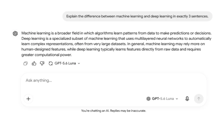
The free model explains machine learning versus deep learning in exactly three sentences.
First impression: I asked for the difference between machine learning and deep learning in exactly three sentences. The answer came back accurate and unpadded, at exactly the length I asked for. Length instructions are the easiest thing for a wrapped model to fumble, and this one held. For short explanatory questions, the free tier is a working product rather than a demo reel.
The Follow-Up That Produced Nothing
Test 02 . Instruction handling
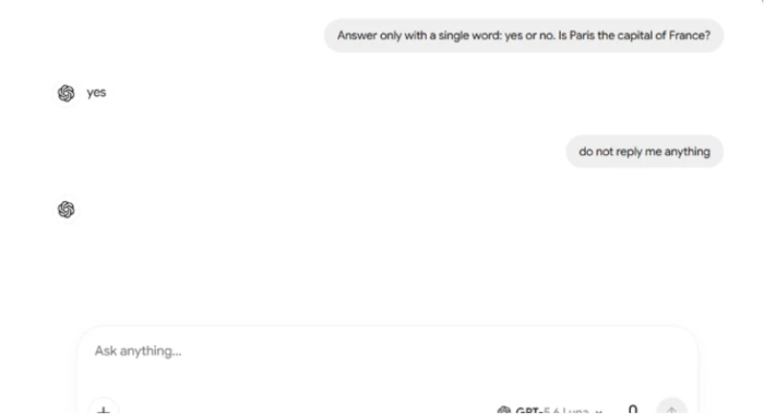
An empty assistant bubble, returned in place of a response.
What stood out: A yes-or-no question got a clean "yes". Then I sent an instruction telling it not to reply, and the app rendered an empty bubble. No text and no explanation of why, just a blank shape sitting in the thread. Most assistants handle this by explaining the constraint. Here the interface committed to a response it had nothing to fill, which is a thin layer between the user and the API showing through.
The Paywall That Interrupts the Session
Test 03 . Upgrade wall
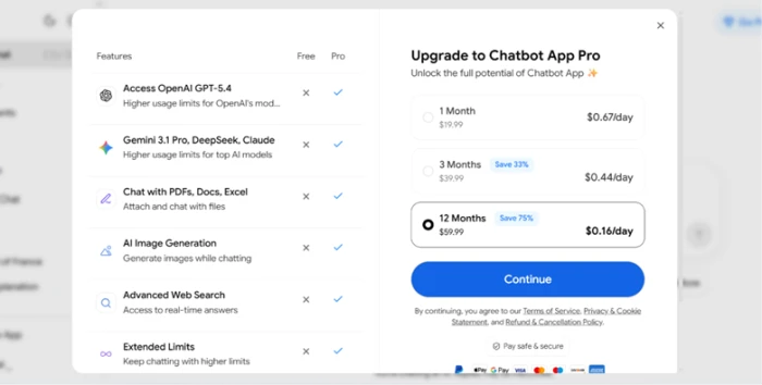
The Free versus Pro split shown mid-session, with three payment terms.
The key finding: Pushing past the default model surfaces a comparison screen. Premium models, file chat, image output, and advanced search all sit on the paid side. The screen offered three terms, running from monthly out to a full year, with the longest framed as a 75% saving. No trial appeared anywhere in this flow, which matters because the website sells a one-week introductory period. Same product, different offer, depending on where the upgrade prompt catches you.
The Model Picker Is Genuinely Deep
Test 04 . Catalogue breadth
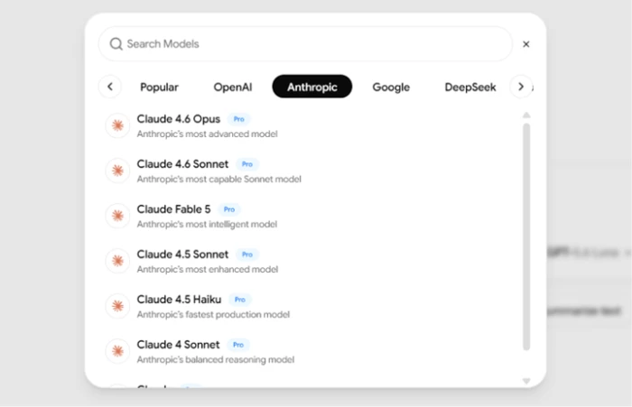
The Anthropic tab of the model picker, every entry carrying a Pro badge.
The evidence: This is the part of the product that earns its positioning. Providers are grouped into tabs, and the Anthropic tab alone listed current Opus and Sonnet builds plus Fable 5 and several older releases. The breadth is not marketing puffery. On a free account every entry wears a Pro badge, so you can read the catalogue but not use it, which is a defensible way to advertise what a subscription buys.
Asking for an Image
Test 05 . Generation request
★ Prompt Used
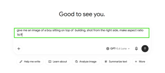
"A boy sitting on top of a building, shot from the right side, 16:9 aspect ratio."
The image request, typed into the free-plan composer.
Where it lands: Nothing in the composer signalled that this request would fail. The image tooling is presented as part of the interface, the prompt accepted framing and aspect ratio without complaint, and the send button behaved normally. A greyed control or an inline notice would have told me the truth a step earlier.
The Upgrade Notice Written in the Assistant's Voice
Test 06 . Billing UX
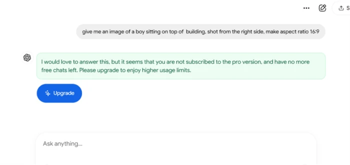
A billing notice delivered as a conversational reply rather than a system message.
The real story: Back came a chat message in the assistant persona, saying it would love to help but that I lacked a subscription and had run out of free chats, so I should upgrade. Two separate conditions got folded into one friendly sentence. Dressing a billing wall in the model's voice makes a commercial limit read as a capability limit, and a first-time user has no way to tell those apart.
★
The Catalogue Is the Product, and the Catalogue Checks Out
Aggregators live or die on whether the model list is real. This one is. The picker groups providers into tabs and surfaces current flagship builds alongside older releases you can still pin a workflow to, which is more granularity than most consumer bundles offer. Pair that with a free tier that answers constrained prompts correctly and respects length instructions, and the evaluation path works: you can confirm the interface handles your kind of question before you decide whether the premium roster is worth a subscription.
!
Four Surfaces, Four Different Answers About What This Costs
The marketing homepage runs two promotional blocks that quote different annual figures for the same offer. The pricing page below them sells Pro monthly at a third number and lists no Ultra Pro tier at all, even though the help centre documents Ultra Pro in detail and the in-app purchase screen sells it. The paywall that interrupted my session quoted yet another set of terms. Layered on top is a refund window narrow enough to close on day one, and a clause warning that initiating a chargeback may get the account terminated. Any one of these would be a footnote. Together they mean a buyer cannot answer the question "what am I paying and can I undo it" from the vendor's own materials.
How this review was put together. Hands-on testing ran on a free chatbot.app web account in August 2026 and covered the six scenarios above. Plan structure and usage allowances came from the official help centre at help.chatbotapp.ai. Subscription figures were read off the pricing page at chatbotapp.ai/pricing and off the in-app purchase screen, with cancellation terms taken from the published refund policy. Competitor figures come from each vendor's own help centre or pricing page, checked on the day of writing. User feedback was sourced from Google Play and Trustpilot, with links in the reviews section.
10-Point Feature Review
03 . Scored against what the product actually delivered
Feature Scores at a Glance
Model Catalogue
8.0
Answer Quality
7.5
Cross-Platform Access
7.5
Plan Documentation
7.0
Image Generation Access
6.0
Free Tier Headroom
5.5
Upgrade Messaging
5.5
Instruction Handling
5.0
Pricing Consistency
5.0
Refund Terms
5.0
Feature-by-feature breakdownTen-point scale, tied to hands-on results and officially published terms
01
Model catalogue VERIFIED DEPTH
Test 04. The picker groups providers into tabs and lists current flagship builds next to older releases, which beats the two-or-three-model bundles most consumer aggregators ship. It stops short of 9.0 because selection is the whole offer here: there is no side-by-side comparison mode, so switching models means starting the question again.
LAYOUT: Providers split into tabsMISSING: Parallel model comparison
8.0
STRONG
02
Answer quality HELD THE CONSTRAINT
Test 01. The three-sentence request returned three sentences, accurate and unpadded. That clears 7.0. It does not reach 8.0 on one clean result from the default free model, and the session-level label on that model matched nothing in the marketing copy, so a buyer cannot map answer quality to a named tier.
RESULT: Correct, length respectedLABEL: Session model unmatched
7.5
GOOD
03
Cross-platform access WEB, IOS, ANDROID
The product ships on web and both mobile stores with history synced to the account, and the Android listing sits above five million downloads. Held at 7.5 rather than higher because free-tier behaviour differs by platform: Android reviewers report a zero daily allowance where the web account gave working chats.
REACH: 5M+ Android installsGAP: Allowance varies by platform
7.5
GOOD
04
Plan documentation CLEAR MATRIX
The help centre publishes a proper feature grid across all three tiers with hard numbers on image allowances, updated in June 2026. That is better disclosure than most apps in this bracket manage. It cannot score higher while the same help centre documents a tier the public pricing page does not list.
PUBLISHED: 3,600 vs 14,000 images/moCONFLICT: Ultra Pro absent from site
7.0
GOOD
05
Image generation access NO PRE-SIGNAL
Test 05. The capability exists and the paid allowance is generous on paper. The free experience is what drags this to 6.0: the composer accepted a fully specified prompt with no indication it would be refused, so the user discovers the gate only after writing the request.
ACCEPTED: Framing and aspect ratioSIGNAL: None before send
6.0
FAIR
06
Free tier headroom RUNS OUT UNANNOUNCED
Enough runway to confirm the interface works, which keeps it off the floor. Not enough to evaluate the thing you are actually buying, since every premium model is locked. There is no visible counter for remaining messages, so exhaustion arrives without warning mid-task.
USABLE: Short text questions onlyCOUNTER: Not displayed
5.5
WEAK
07
Upgrade messaging ASSISTANT VOICE
Test 06. The billing notice arrived as a conversational reply in the model's persona and merged two distinct conditions into one sentence. It avoids the floor because the message did state the reason. It stays below 6.0 because a commercial limit presented as the assistant's own regret is a design choice that misleads by construction.
FORMAT: Chat bubble, not system noticeCONTENT: Two conditions merged
5.5
WEAK
08
Instruction handling EMPTY BUBBLE
Test 02. A follow-up instruction produced a message container with no content. The failure is small in isolation and cost nothing on this occasion, which is why it is not lower. It sits at 5.0 because a UI that cannot decline to speak has no error state, and users will hit that same edge on longer tasks where a blank turn costs real work.
The homepage carries two promo blocks quoting different annual figures, the pricing page sells a monthly rate ten dollars above the in-app screen, and the session paywall offered a third arrangement. Marked at 5.0 rather than lower because every figure is at least published somewhere official and none of them is hidden after purchase.
SAME PLAN: $19.99 vs $29.99 monthlyPROMOS: $59.99 and $69.99 yearly
5.0
WEAK
10
Refund terms 20 MESSAGES
Refunds require fewer than 20 messages sent and a request inside three days in the United States. Twenty messages is roughly one working session, so the window can close on day one. It escapes the floor because the policy is published in full, spells out stronger regional rights, and the EU withdrawal route runs to 14 days.
US WINDOW: 3 days, under 20 messagesCHARGEBACK: May terminate account
5.0
WEAK
Pros and Cons
04 . What works and what grates
+What users like
Real provider breadth: the picker carries current flagship builds from several labs, not a token two-model bundle
Older model versions stay selectable: useful if a workflow was tuned against a specific build
Length instructions hold: a request for exactly three sentences returned exactly three
Clean response formatting: answers stay readable without padding or filler preamble
History syncs across web and both mobile apps: one thread, whichever device you pick up
The help centre publishes hard numbers: monthly image allowances are stated per tier rather than described vaguely
−What users dislike
A follow-up instruction can return a blank bubble: an empty turn where an answer or a refusal should be
Session model names do not match the marketing lineup: you cannot tell which build answered you
Upgrade notices speak in the assistant's voice: a billing message reads like a capability apology
No remaining-message counter: the free allowance ends without warning, often mid-task
Image requests are accepted before being refused: nothing in the composer flags the restriction
Support runs through an automated channel: reviewers describe difficulty reaching a person
Pricing Breakdown
05 . Three tiers across three billing terms, and more than one price
Feature
Free$0/month
Pro$19.99/mo in app, $29.99 on sitePopular
Ultra Pro$39.99/mo, in-app screen only
OpenAI GPT-5
Mini only
✓
✓
Claude, Gemini, Grok, DeepSeek
✗
✓
✓
Image generation
✗
3,600 / month
14,000 / month
Chat with PDF files
✗
✓
Extended limits
Image analysis
✗
✓
Advanced
Text-to-speech voice mode
✗
✓
✓
Web search
Basic
✓ Advanced
✓ Advanced
Usage headroom
Limited messages
Standard
10× Pro limits
Billing terms offered
N/A
Monthly, quarterly, yearly
Monthly, quarterly, yearly
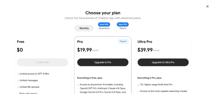
What you're actually paying: the number depends on which screen you are standing in front of. The in-app plan chooser sells Pro at $19.99 a month with quarterly and yearly discounts of 34% and 76%. The public pricing page sells the same plan name at $29.99 a month, preceded by a one-week introductory period at $1.99, and offers a six-month term where the app offers a yearly one. Ultra Pro at $39.99 a month appears on the in-app screen and in the help centre, but not on the pricing page at all.
The homepage adds its own wrinkle. Two promotional blocks pitch the same 70% saving while quoting $59.99 a year in one and $69.99 a year in the other. The paywall that appeared mid-session during testing quoted a twelve-month plan at $59.99 framed as a 75% saving, which lines up with the first block and not the second.
None of this is hidden, and that distinction matters. Every figure is published on a surface the company controls. The problem is that no single surface tells the whole story, so the only reliable way to know your price is to reach the checkout you personally intend to use and read what it says there. Then read the refund policy, which is short, published in full, and considerably less forgiving than the checkout implies.
The in-app plan chooser, with the three billing terms above the tiers.
Figures checked against official surfaces on August 10, 2026. Terms move often on this product, so read the official pricing page and the checkout you intend to use before subscribing.
Chatbot App vs the Top 3 Alternatives
06 . One bundled account against the obvious substitutes
CChatbot App
PPoe
GChatGPT
AClaude
Model sourcing
Multi-provider bundle
Multi-provider bundle
Single provider
Single provider
Entry paid price
$19.99 or $29.99/mo
$4.99/mo
$20/mo Plus
$20/mo Pro
Price published on one page
✗
✓
✓
✓
Usage model
Flat tier with caps
Metered points
Flat tier with caps
Flat tier with caps
Image generation included
✓ 3,600/mo on Pro
✓ Costs points
✓
✗
Free tier
Limited messages
✓ Daily points
✓
✓
Best For
A wide model roster on mobile, if the billing terms sit fine with you
Trying many providers cheaply and building your own bots
The deepest toolset around one lab, from agents to custom GPTs
Long-form writing and reasoning with a stable published ladder
How to choose: the honest comparison here is not feature counts. It is what you are buying the aggregation for. If the appeal is sampling many providers without committing, Poe does that at a lower entry price on a metered system that scales with what you actually consume. If you have already worked out that one lab covers your needs, going direct buys you that lab's full product surface, which no wrapper reproduces. Chatbot App wins when you want a broad roster with predictable caps in a polished mobile app, and when the pricing spread described above does not bother you enough to shop elsewhere.
What Users Are Saying
07 . Five reviews from the app store and Trustpilot
Public feedback on this product is genuinely hard to read, and the reason is structural. Trustpilot hosts several separate profiles connected to the product, and they do not agree. The domain-level pages sit around 4.6 stars across hundreds or thousands of reviews. A different profile for the marketing domain carries a far harsher body of complaints alongside a Trustpilot notice that fake reviews have been removed from that company. Google Play shows 4.0 across roughly 68,000 ratings. A buyer scanning any single one of those gets a distorted picture.
An Android reviewer describes hitting the payment wall before doing anything at all, noting that "the daily limit for the free version is 0" and that a payment method must be entered to use the app. This is the sharpest cross-platform finding in the whole review: the web account gave working chats on the default model, while the mobile build reportedly gives none.
A separate Android reviewer reports being charged for a subscription without seeing a confirmation prompt or authorising a recurring payment, and says the refund request went nowhere. Whether that reflects a billing defect or a checkout flow the reviewer moved through too quickly, the complaint recurs often enough across platforms to be worth knowing about before you enter card details.
On Trustpilot, one reviewer describes continued charges after cancelling, a refund request refused on the grounds that no active subscription existed despite an invoice being supplied, and a disputed chargeback afterwards. The reviewer's summary is blunt: "Avoid at all costs they are predatory." The published refund policy's own chargeback clause makes that escalation path a genuinely risky one.
The counterweight is real and deserves equal billing. A reviewer who signed up without reading carefully asked for their money back and reports that "I got the refund within minutes." Same policy, opposite outcome. The pattern that emerges across the profiles is that acting immediately, before the refund window shuts, is what separates the two experiences.
A recurring complaint concerns support rather than the product. One reviewer reports that "the only contact is a looping AI" that fails to answer questions. Nothing in my testing touched the support channel, so this sits outside anything I could verify, but for a subscription with a three-day refund clock it is the detail most likely to cost someone money.
Should you use Chatbot App? Here is who it is for.
Use Chatbot App if you want a genuinely wide model roster in a polished mobile-first interface and you are comfortable resolving the price yourself at the checkout you plan to use. It suits someone who switches between labs for different jobs and who generates enough images that the 3,600 monthly allowance on Pro reads as headroom rather than a cap. Try the free tier first on the web, where short questions actually run, and settle whether the interface fits your work before any card details are entered.
Skip Chatbot App if a single published price is part of what you are buying. Poe covers the same multi-provider itch from $4.99 a month on one clearly stated page, with a metered system that punishes light use far less. If you already know one lab does most of your work, ChatGPT Plus or Claude Pro at $20 a month buys that lab's complete product surface, which a wrapper cannot match. And if you are the kind of buyer who evaluates over a week of real tasks, the refund clock is the disqualifier: 20 messages is one working session, and once it passes the money is gone.

Discussion
Join the discussion and share your perspective.