Napkin skips the prompt box entirely. You highlight text you have already written, click one icon, and it hands back a spread of editable diagrams within seconds, with a nine-option editing menu that outclasses most tools in its class. It fits writers, marketers, and analysts who want a fast visual from prose they already trust.
Napkin turns writing you already have into diagrams, flowcharts, mind maps, and data charts. Rather than describing a picture in a prompt, you let it read the structure of what you wrote and suggest visuals that match, so it works best on text that is already clearly organised.
It is made by Second Layer and aimed at people who work in documents and decks but are not designers, such as educators, product managers, consultants, and writers. Napkin runs in the browser on desktop, imports from PowerPoint, Word, PDF, HTML, and Markdown, and exports to PNG, PDF, PowerPoint, SVG, and Google Slides. A permanent free tier sits under two paid plans, Plus and Pro, starting at $9 per person a month.
What Happened When We Tested It
02 . 6 tests covering generation, charts, imports, and exports
I generated visuals from five pieces of text totaling 182 words on a fresh free account, then imported a PDF and worked through every export and sharing option the free plan allows. The inputs were written for a US small-business reader and used concrete terms like LLC and EIN on purpose. Vague sample text papers over the exact failures worth finding.
A Five-Step Launch Process
Test 01 . Generation
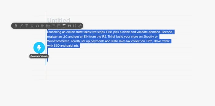
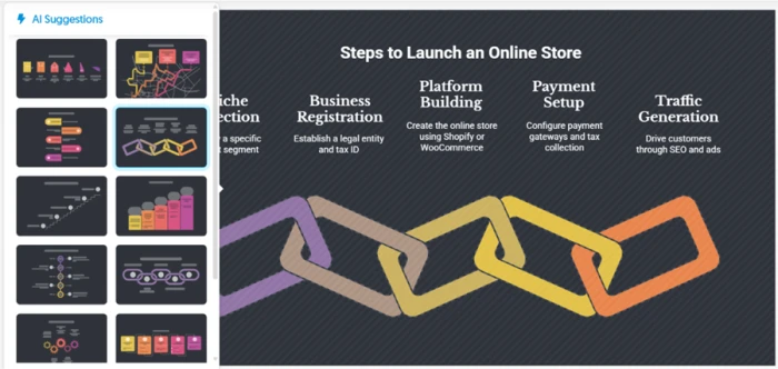
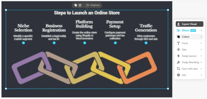
Selecting text surfaces a single Generate Visuals icon. No prompt box, no settings.Ten layout suggestions arrived in seconds, including staircase and gear-chain designs.The editing menu: Swap Layout, plus one-click minus icons to delete a stage.
What we observed: A 50-word paragraph became ten layout options, and the linked-chain design placed all five steps in the right order with clean headings. Editing is where Napkin pulls ahead. Swap Layout drops the same content into a fresh design, and deleting a stage takes one click. Then I compared the visual to my source and found the catch. I wrote "register an LLC and get an EIN from the IRS," and Napkin rendered "Establish a legal entity and tax ID." For a US founder, the LLC and the EIN are the whole actionable point of that step, and both were gone.
Six Months of Traffic as a Chart
Test 02 . Data charts
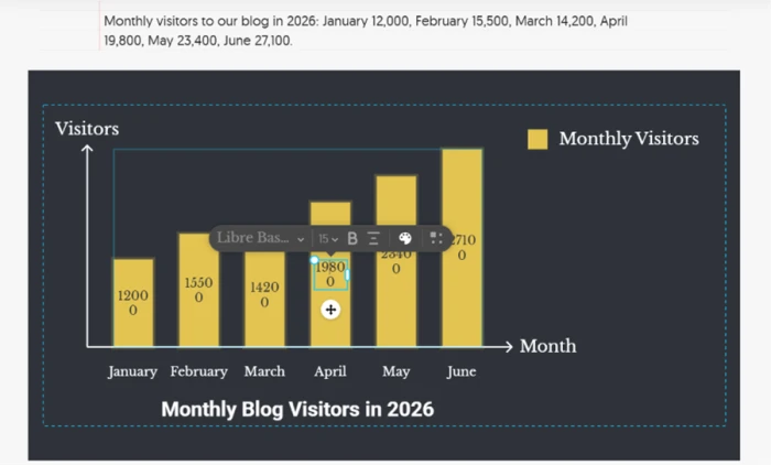
Bar heights tracked the numbers, and every value label opens its own font toolbar.
Where it lands: I typed six months of blog traffic, from 12,000 visitors in January up to 27,100 in June with a dip in March. Napkin read the shape correctly, the March dip showed, and each label is individually editable. The formatting is not ready to publish. Labels wrap mid-number, so 12,000 renders as "1200" with a stray "0" beneath it, thousands separators vanish, there is no y-axis scale, and the June label spills over the top of its bar. Every label would need resizing by hand first.
A Short List and the Customize Panel
Test 03 . Added content
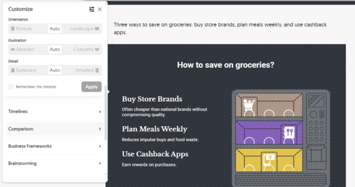
Three tips in, three tips out, each carrying a description Napkin wrote itself.
The signal here: A 16-word sentence with three grocery tips kept all three as headings, then added a line of description under each that I never supplied. "Often cheaper than national brands without compromising quality" is a fair sentence, but it is Napkin's sentence, and it ships under your name. The Customize panel is the redeeming part: orientation flips portrait to landscape, an Illustration slider runs abstract to concrete, and a Detail slider expands or trims the text. I found no language setting anywhere, despite Napkin advertising support for over 60 languages.
Messy Writing In, Invented Content Out
Test 04 . Fidelity
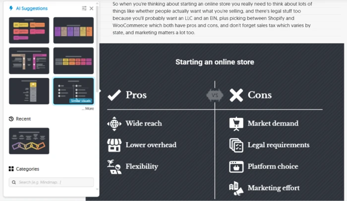
A throwaway phrase about Shopify and WooCommerce became a full Pros vs Cons chart.
What this confirms: This was the revealing one. I rewrote the store topic as a rambling 67-word paragraph and mentioned in passing that Shopify and WooCommerce "both have pros and cons." Napkin built an entire Pros vs Cons chart around the phrase. Every pro on it, "Wide reach" and "Lower overhead" among them, came from Napkin, not me. My real steps got relabeled as cons, validating demand and forming a business collapsed into "Market demand" and "Legal requirements," and sales tax vanished. Same topic as Test 1, yet the chart asserts things I never wrote. Feed Napkin clean steps and it stays close to your meaning. Feed it stream-of-consciousness and it fills the gaps with guesses.
Four Metrics In, Two Out
Test 05 . Data fidelity
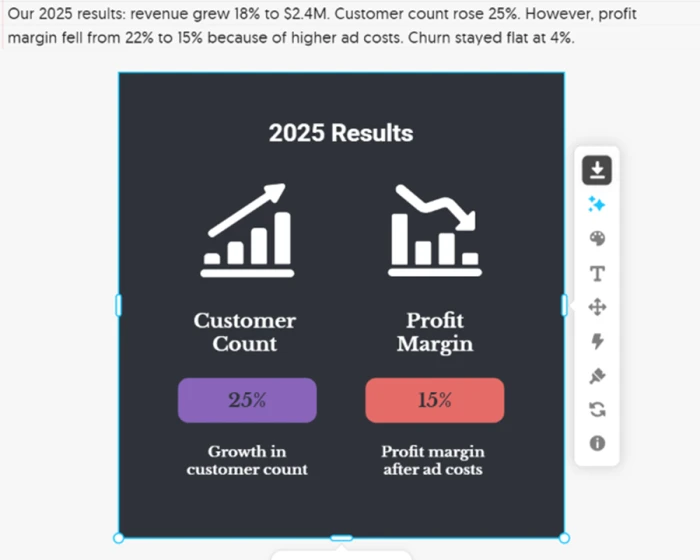
Two of the four figures made the visual. The headline revenue number did not.
Worth noting: I wrote a 30-word update carrying four figures: revenue up 18% to $2.4M, customers up 25%, margin down from 22% to 15%, and churn flat at 4%. The visual kept two, customer count and profit margin. Revenue, the number any results summary leads with, was dropped alongside churn, and the 15% margin appeared with no sign of the 22% it fell from. Napkin did read the direction correctly, pairing a falling-bar icon with a red badge for the margin decline.
Importing a Research PDF
Test 06 . File import
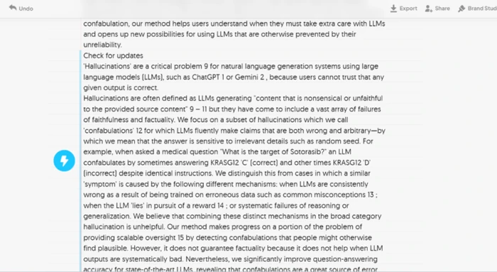
The imported paper arrived as one unbroken page with its headings gone.
The takeaway: Free accounts import without limit, so I uploaded a research paper. The text came through as a single continuous page with section headings stripped out. Citation numbers ran into the sentences, producing fragments like "problem 9" and "ChatGPT 1 or Gemini 2," and a stray "Check for updates" link sat marooned in the body. Budget a cleanup pass before generating anything from an imported file.
★
Clean structure in, faithful visual out, in one click
When the input was ordered, numbered steps or a tidy data series, Napkin nailed it. The five-step launch landed in sequence, the six-month traffic chart matched every bar height including the March dip, and the editing menu let me reshape or trim any of it in seconds without touching a design tool. On structured text, the generation-first workflow is measurably faster than building the same diagram by hand.
!
It rewrites your words and invents content you never wrote
Across the tests Napkin stripped "LLC" and "EIN" down to generic phrasing, wrote its own descriptions under a list, built a whole Pros vs Cons chart from one offhand clause, and dropped the headline revenue figure from a four-metric update. If you publish a Napkin visual without checking it line by line against your source, you are publishing Napkin's claims, not yours.
How this review was put together. Testing ran on September 30, 2026, on a free Napkin account, covering five text-to-visual generations totaling 182 words, one PDF import, and the full export and sharing flow the free plan permits. Every input was written from scratch for the session so the output could be checked against a known source. All pricing was verified the same day on Napkin's official pricing page at napkin.ai/pricing.
10-Point Feature Review
03 . Scored against what the tests actually showed
Feature Scores at a Glance
Editing controls
9.0
Generation speed
8.5
Free-plan export
8.0
Credit value
8.0
Sharing and permissions
7.5
Layout variety
6.5
Chart data accuracy
6.0
Chart label formatting
5.5
PDF import handling
5.5
Source text fidelity
5.0
Pros and Cons
04 . What a real user notices, day to day
+What works
No prompt engineering: you highlight text you already wrote and click once, with nothing to phrase or configure
Fast, plural suggestions: a spread of layouts appears in seconds, so you compare rather than commit blind
Faithful on structured input: numbered steps and clean data series come back matching what you fed in
−What frustrates
Chart labels need hand-fixing: wrapped numbers, missing separators, and no y-axis scale
Repetitive layouts over a session: the same design families recur, so a full article can look samey
Desktop-only and always online: no offline mode and no phone-first experience
Pricing Breakdown
05 . Free forever, then two paid tiers
Feature
Free$0forever
Plus$9/person/moPopular
Pro$22/person/mo
AI credits
500 / week
10,000 / month
30,000 / month
PNG & PDF export
✓ unlimited
✓ unlimited
✓ unlimited
PPT & SVG export
3 free, then locked
✓ unlimited
✓ unlimited
Napkin branding removed
✗
✓
✓
Brand styles
✗
3 styles
Unlimited custom branding
Upload your own fonts
✗
✗
✓
Team management
✗
✓
✓
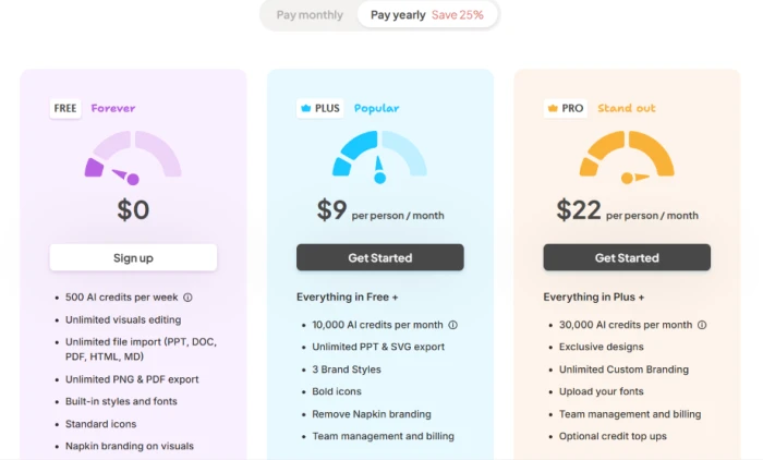
What you're actually paying: The free tier is unusually complete, so the real question is what pushes you off it. Two things do the practical work. The watermark sits on every free export until you upgrade, and SVG, PowerPoint, and Google Slides stop after three free exports each, which is the wall a content team hits fastest. Plus clears both. The jump to Pro is really a bet on volume and branding depth, and nothing in testing suggested a solo user needs it over Plus. Annual billing takes 25% off either paid plan.
The three tiers as shown in-app, with the yearly toggle advertising a 25% saving.
Pricing verified September 30, 2026. Plans shift without notice, so confirm the current rates on the official pricing page before you subscribe.
Napkin AI vs the Top 3 Alternatives
06 . How it sits against the tools buyers shortlist
NNapkin AI
PPiktochart
CCanva
MMapify
Entry paid plan
$9 / mo
$15 / mo, $10 annual
$144 / year
$9.99 / mo, $5.99 annual
Free tier
Yes, 500 credits/wk
Yes, 2 PNG downloads
Yes, broad
Yes, 30 one-time credits
Core method
Select text, auto-generate
Template plus AI infographic
Template plus Magic Design
PDF or video to mind map
Free export
Unlimited PNG, PDF
2 downloads total
PDF, JPG, PNG
PDF, Markdown, SVG
Best For
Turning existing prose into a diagram fast
Data-heavy infographics and reports
An all-purpose design suite
Summarizing long PDFs into mind maps
How to choose: Napkin wins on one specific job, converting writing you already have into an editable diagram with the least friction, and its free export beats all three rivals outright. Reach for Piktochart when the deliverable is a dense, data-driven infographic or report where you want template control from the start. Pick Canva when you need one subscription to cover presentations, social, video, and print rather than diagrams alone. Choose Mapify when your starting point is a long PDF or video you want condensed into a mind map rather than a paragraph you want illustrated. If your work is mostly prose that needs the occasional visual, Napkin is the cheapest monthly entry and the fastest path.
What Users Are Saying
07 . Verified reviews from G2
Napkin is so user friendly, fast to learn and the outputs files are everything that you need to move forward with any visual presentation. Sometimes the colours can be hard to choose, and I'm not always sure which option to go with.
Napkin AI still struggles a bit with very abstract or loosely defined inputs, and the visual themes can feel somewhat repetitive after multiple uses. I'd also like to see more integration options, with Notion, Miro, or PowerPoint.
The only aspect I don't like is that when I copy the content, it gets copied as a single image. I would prefer if the text remained as text, with only the designs being copied as images.
What I would like to see improved is the understanding of the text. The infographics produced tend to default to various forms of lists which shows there's no real understanding of the different relationships between concepts.
Napkin AI should support multiple languages rather than English only. It saves us from putting extra effort on designing visually appealing graphics for our slides, so we can focus on our day to day code writing only.
Use Napkin if you write clean, structured content and want an editable diagram from it in seconds, you can afford one proofread of every visual against your source, and unlimited free PNG and PDF export matters to you.
Skip Napkin if your inputs are loose or numbers-heavy and accuracy is not negotiable, or you want one suite for design beyond diagrams. Piktochart handles data-dense infographics with more control, and Canva covers the wider design job.



Discussion
Join the discussion and share your perspective.